Step 1: The Exhibition
Questions about the exhibit:
1. What is the title of the exhibit?
Mind and Matter
2. What is the theme of the exhibition?
Exploring one's inner psychology and the physical space surrounding oneself
Step 2: The Gallery
Questions about the physical space:
1. What type of lighting is used?
Plain overhead fluorescent spot lights
2. What colors are used on the walls?
White
3. What materials are used in the interior artchitecture of the space?
Carpet and wood? Not quite sure what kind of answer you're looking for here?
4. How is the movement of the viewer through the gallery space?
Well when you walk into the gallery you have two options you can either go right or left. I'll tell your right now that the exhibit is closer to your right. Which is where I went. I then chose to go right again orbiting the center wall and then pretty much following the perimeter of the exhibit.
Step 3: The Artwork
Questions about the artwork:
1. How are the artworks organized?
The majority of the pieces are hung up on walls. There a couple pieces that are lied out on table, and there are even a few pieces lying on the ground up against the wall, kind of like that of a memorial.
2. How are the artrworks similar?
Well for one thing they are all created by two people. Another thing is that they are all, for the most part, paintings; and the seemed to be abstract paintings at that.
3. How are the artworks different?
Being that this exhibit was done by two different people you can distinguish between the two style's. Liz's painting seem to have bit more color to them, or they are at least a bit more saturated, where as Jane's seem to pale and dull. Also Jane's appear to be a lot more cleaner than Liz's. Hers seems to lack organization in that they are somewhat chaotic.
4. How are the artworks framed?
The pieces appear to be just oil on canvas. I am not sure what the technical name for the framing would be. There are a couple pieces within wooden frames.
5. How are the artworks identified and labeled?
They are not labeled. As you may or not be able to see, there are two walls with names on them. One being Liz Parsons and the other being Jane Dell, and I assume that they group the pieces that each artist did. So Liz's are on one side of the room and Janes are at the other end. Other than that, that's all you have to go on.
6. What is the proximity of the artwork to each other?
They range. Most are with 2 to 3 feet away from each other. Some I'm not quite sure if the pieces are right on top of each other or if the whole thing is one piece.
Step 4:
Art Criticism Exercise
Select three of the artworks from the show and use the Art Criticism worksheet to desribe, analyze, bracket and interpret the work using the 5-step Art Criticism Process described. (see the sheet in the module folder)
Take pictures of the images you are interpreting. If this is not allowed, make quick sketches of the pieces.
Artist - Liz Parsons
Title of Work - Mind and Matter
Media - Oil on Canvas?
Date - June 1st
Size - 3' x 5'?
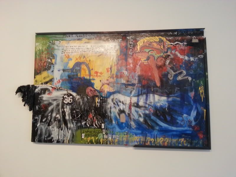
Source - http://i54.photobucket.com/albums/g88/lacrossebap3x6/AED%20200%20Art%20Gallery%20Visit%20_2/20130724_094715_zps447c88ec.jpg
Description - This piece is really difficult to describe because there is quite a lot going on within it. If look at it broadly you can see that the piece is made up of four quadrants. Each one having a different overall primary color. One with red, one with blue, one with yellow, and one which has green. If you take a look at the bottom right quadrant, the green one, you will notice that there is giant condor occupying that entire space, and even extending itself off of the page. Beneath the condor is some text, which if you can make it out says "I am a California Condor, not a turkey." Diagonally across from the condor is the red quadrant where it looks to be someone's insides made with what looks like actual telephone wire. Beneath that quadrant looks to be waves emanating from the condor. The entire piece looks like a chaotic piece of messy graffiti. I say messy, because even graffiti appears to have a little bit of organization to it.
Formal Analysis - Well the piece certainly has a lot of variety to it. It contains no symmetry at all, just completely and utter chaos creating areas of conflict and interest. Your eyes don't know where to start. Mine seem to start on the blue quadrant and go counterclockwise following the path of the three primary colors: blue, red, and yellow. The image of the condor seems to dominate the piece, gaining the most attention out of the piece, extending itself beyond the frame.
Bracketing - I am a simple person. I am not one to read into things that are not even there. But forcing myself to look, if I squint my eyes a little bit I can kind of see the windows logo. Not something you'll clearly be able to see. You'll have to use some of your imagination, Obviously the text has to have some kind of special meaning behind it. What it is I'm not sure
Interpretation - I really have no idea what the artist was trying to say. I feel that if anything the key to unlocking it, is the vulture, whoops I'm sorry the Condor. Hmm well Condor's usually pry on the dead, unlike a turkey. I don't it seems like it wants to clarify something except it's only making it more confusing.
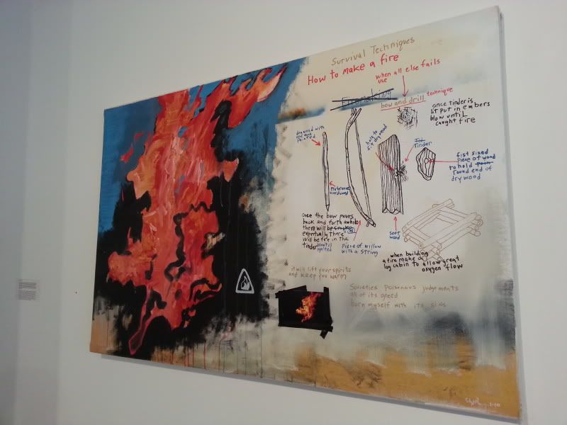
Artist - Liz Parsons
Title of Work - Mind and Matter
Media - Oil on Canvas?
Date - June 1st?
Size - 3' x 5'?
Source - http://i54.photobucket.com/albums/g88/lacrossebap3x6/AED%20200%20Art%20Gallery%20Visit%20_2/20130724_094723_zps2be25738.jpg
Description - This one is much more simpler to describe. The piece is separated into two sections: left and right. The left side looks like some sort of fire, while the right side appears to be a some sort of schematic, one which apparently teaches you how to make a fire.
Formal Analysis - The piece seems to have seperated two sections roughly equally or at least according to the eye. The piece makes use of contrast with the use primary colors on primary colors i.e. red on blue as well as red on black. The piece also makes use of scale, as well as line in the drawings on the right section.
Bracketing - This piece reminds me of something I would see at a toxic spill, almost like a warning, more than a tutorial.
Interpretation - I feel like the artists has no deeper meaning but to teach the viewer how to make a fire.
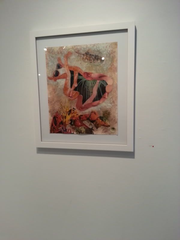
Artist -Jane Dell
Title of Work - Mind and Matter
Media - Colored Pencil?
Date - June 1st?
Size -11" x 13"?
Source - http://i54.photobucket.com/albums/g88/lacrossebap3x6/AED%20200%20Art%20Gallery%20Visit%20_2/20130724_095030_zpscb7bbb56.jpg
Description - This piece appears very nautical, although there is not a trace of blue within the image. On the bottom of the page is what appears to be a coral reef, while above that is what looks like a seahorse type of creature. His body almost looks like a doorway, revealing a palm tree within him. Above that although somewhat faded is a stingray like creature.
Formal Analysis - This piece relies heavily on shape and form what with the creature and the coral reef. This piece is also able to apply the use of negative space by looking inside the creature's stomach. The fadedness of the stingray like creature in the back adds depth to the image making like the seahorse kind of thing seem closer.
Bracketing -Looking closely at this picture I saw that this seahorse like creature is actually composed of human feet. The creature reminds me of a seahorse.
Interpretation -Palm Trees. Feet. I think the author is obviously trying to tell us to relax. Not sure if that is her actual meaning but who knows
Step 5:
Document Your Visit
Take some pictures (no flash) if it is accepted at the Gallery you are visiting.
Make sketches if you are not able to take photographs.
Bring home brochures and other materials for reference.