1. Hyperlink the Blogs you reviewed into your Blog
http://gracesplanetworld.blogspot.com/
http://foreverart223.blogspot.com/
2. When looking at Project #1: (Elements and Principles), did you
agree with the element or principle the artist listed with the images?
Did you see other elements and principles in the images?
I could definitely see where each person was coming from with their pictures, but like most photos they each contain more than just one element. In some of the images I felt that there were more obvious elements, than what they used it for. Grace's picture of Shapes for example I felt displayed space more than it did shape.
3. When looking at Project #2: Where there any images in the Peer
Blogs the same aFor exas your own? If yes, what were they? Where the reasons
the image was selected the same or different as your own?
Unfortunately I do not live in the Buffalo area, so the Albright Knox is unavailable to me at the moment, so I had to attend another art gallery that was in my local area.
4. Where there any images that your Peers selected that pique your
interest now? If yes, what are they and what is your connection with
them? What would you want to know about them?
A lot of people seem to choose Grace's picture for space, which the more I look at it, the more it interests me. I guess I would like to see the picture zoomed out to see the environment she was in when she took the picture.
5. What do you think about the process of reading your peers reflection? Do you find this to be a valuable in your learning?
It's somewhat valuable in that I get a sense on how they felt about their projects, and that some of us have similar views on things.
6. Check your Blog and read comments posted by your Peers. Do you find their comments helpful?
None of the comments were really helpful, because I don't believe that was their purpose. I did find them interesting to read though. For example Britten commented on my photos and told me that my concepts were not exactly clear by just looking at the image, but by reading my accompanying text he was able to understand it. So I guess it was helpful in the sense that maybe I should have tried for something more universally understood.
Saturday, June 29, 2013
Module Six - Blog: Video Review
This week we have been asked to watch the following videos and answer the questions below:
Through the Eyes of a Sculptor
Glass and Ceramics
Installation Art
1. For each video list/discuss the key concepts you learned.
Video #1 Through the Eyes of a Sculptor
This video illustrates core concepts of sculpture and it does so by following master sculptor Emmanuel Fillion from initial concept to final product, final product being a life size marble sculpture of a naked woman. They first have to sketch it out onto paper, they then sculpt it out of clay, from there they make a casting of it, then after that is done they then begin to carve it out of marble. They also go into depth on how the marble is obtained, by essentially mining it from quarries.
Video #2 Glass and Ceramics
The video goes over the fundamentals of glass making and ceramics. Glass is made by heating sand until it essentially breaks down and becomes a liquid, glass makers then begin to shape the glass with a mixture rotating it and blowing into it. The glass is then left to harden. Ceramics uses a similar concept in that instead of heating sand, you heat clay.
Video #3 Installation Art
This video cover different types of installation art and how they each affect their surrounding environment. For example one artist took a chunk out of the museum wall and created an exhibit out of it.
2. How do the videos relate to the readings in the text?
The text describes the different materials and techniques used in sculpture, while the video puts it in perspective by demonstrating it.
3. What is your opinion of the films? How do they add depth to understanding of the topics: Sculpture, Installation, and Craft?
I found the first two videos to be way more interesting than the last one. The first two videos displayed the different processes used to create these works of art, while the Installation Art just displayed the different pieces of installation art and how they worked in the environment. The first two videos essentially taught a basic overview of the skills used to create certain types of pieces such as marble sculpture and stained glass.
Friday, June 21, 2013
AED 200 Art Making/Material Exploration #2 Logo Design
Honestly I've had this logo since High School. I created it to use a name for my production company. When I created it I wanted to somehow incorporate my name. My full name is Brian Andrew Purcell so during my brainstorming process that's where I got Blown Away Productions, by using my initials: B.A.P. When I was brainstorming I wasn't necessarily focused on the name as I was with the image associated with it, and obviously I wanted a cool image. So I started to gravitate towards different natural phenomenon, which is how I ended up with the name Supurcell, which was kind of lucky that my name fits like that. And so now I have Supurcell Productions. I'm still debating about whether or not I want to use the word productions. It's a toss up between Productions or Studios, but for now I chose productions and that's where the S and the P come from, and I obviously the tornado comes from the word supercell. I actually got the image using photoshop the first time around, I just reproduced the sketches because I had to but I did sketch what Blown Away Productions would have looked like when I was considering that name. After the readings I kind of want to go back and change the font to something more like in the sketch where the serf are more sharp.

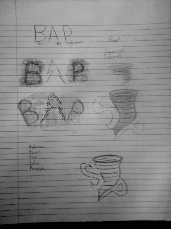 This is just a sample of what I wanted to accomplish

 This is just a sample of what I wanted to accomplish
Thursday, June 20, 2013
AED 200 Art Gallery Visit #1
I visited the Spa Fine Art Gallery
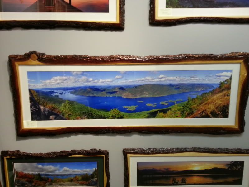
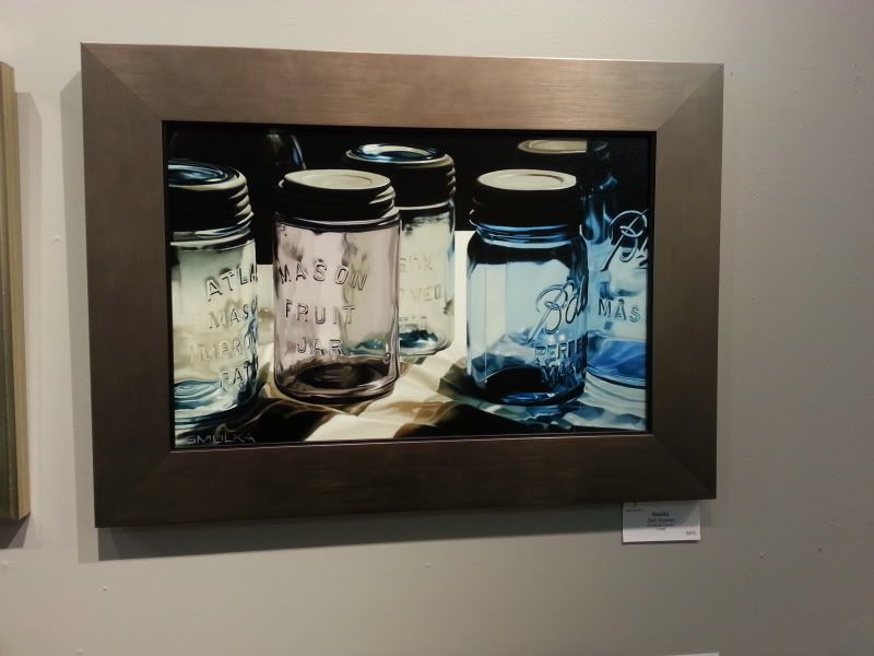
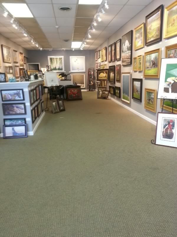 The first two pieces that struck me, well to be honest all of my selections kind of struck me, but the two that made an impact were 32 Miles Of Lake George and Jam Session by Steve Smulka.
I think the sheer scale of the first one is what naturally drew me to it, that and it is a photograph which is what I was mainly looking for. Being a photographer myself I was curious to see what other photographers were taking pictures of. I also really loved the colors in this picture. What drew me to Jam Session was how lifelike it looked. Someone could have easily mistaken that for a photograph.
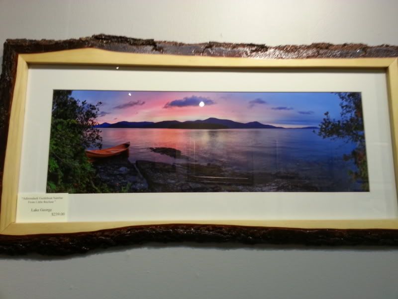
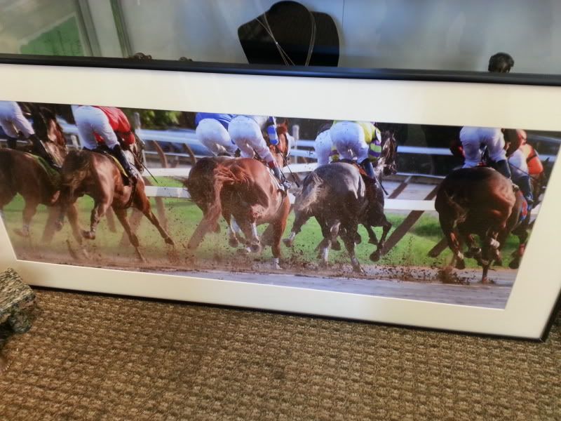
I think the pieces I connected with the most were Adirondack Guide Boat Sunrise from Little Recluse and Midrace by Disney.
I feel like these are pictures that I myself could have taken, because I like to take shots of scenery with a wide range of color, and when I'm taking pictures on the fly I like to get right in the action.
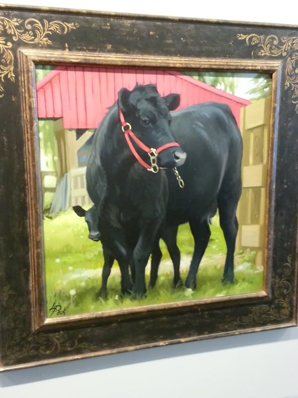
Honestly the pieces I would like to know more about the Lake George pieces but I've already used those, so my third choice I guess would be Dexter With Calf by Leslie Peck and Horse Power by Chammer.
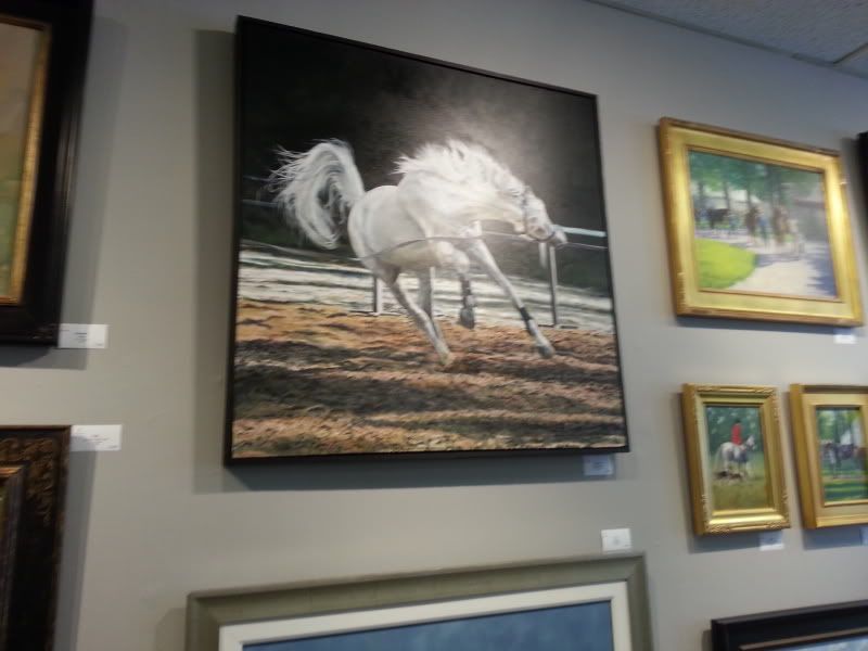
The first piece seems so gentle and calming, while the second piece is very wild and exciting. Both pieces just stand out for some reason and you want to know why.
 The first two pieces that struck me, well to be honest all of my selections kind of struck me, but the two that made an impact were 32 Miles Of Lake George and Jam Session by Steve Smulka.
I think the sheer scale of the first one is what naturally drew me to it, that and it is a photograph which is what I was mainly looking for. Being a photographer myself I was curious to see what other photographers were taking pictures of. I also really loved the colors in this picture. What drew me to Jam Session was how lifelike it looked. Someone could have easily mistaken that for a photograph.
I think the pieces I connected with the most were Adirondack Guide Boat Sunrise from Little Recluse and Midrace by Disney.
I feel like these are pictures that I myself could have taken, because I like to take shots of scenery with a wide range of color, and when I'm taking pictures on the fly I like to get right in the action.
Honestly the pieces I would like to know more about the Lake George pieces but I've already used those, so my third choice I guess would be Dexter With Calf by Leslie Peck and Horse Power by Chammer.

The first piece seems so gentle and calming, while the second piece is very wild and exciting. Both pieces just stand out for some reason and you want to know why.
Saturday, June 15, 2013
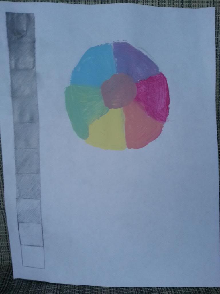
Exploring Value and Subtractive Color Theory
1. Having taken both a drawing class and a painting class making a value scale and a color wheel is nothing new to me. However I'm almost positive I screwed up on the color wheel. When I went to the store to get my paints I grabbed a magenta, and what I thought was a cyan. None of the colors they had said cyan so I picked out what I thought looked like cyan, and I had a lemon yellow at home. If I had looked more closely at the video I would have probably noticed that the colors don't really look that different from regular red, blue, and yellow.
2. Even the I'm color kind of person I enjoyed making the value scale much more. It was way easier and I feel like it took more precision to make. Also it was just plain not messy.
3. The most important thing I learned are that cyan, magenta, and yellow are the true primary colors.
4. As said before I thought that the information about how cyan, magenta, and yellow are the true primary colors was pretty valuable. The theory makes sense that when you comibine red, blue, and yellow you get a turshrary brown color, and not pure black.
Monday, June 10, 2013
Color Theory and It's Emotional Effects
1.
Color is light reflected off an object. For
example a plant reflects green light, an apple reflects red light. Color is
composed of three primary colors red, blue, and green. The combination of two
of these colors will create their complementary: cyan, yellow, and magenta. The
combination of all these colors will create white light, which is why if you
shine light through a prism you will get the visible light spectrum. Different
colors are have different effects on people and the way they feel. For example
in movies if a scene is lit with blue light, the scene will appear cold, and
will make scene seem somewhat grim and serious. Where as if you light it with
yellow light the scene will appear warmer, and therefore more jovial.
2.
I am intrigued by how light and pigments act
differently. With light the primary colors are red, blue, and green. With
pigments, the primary colors are red, blue, and yellow. I guess is due the
green cones in our eyes, but it is still weird how we can physically see blue
and yellow mix to turn green, but when it comes to light, it’s completely
different.
3.
I think just seeing the pigments being made a
lasting impression in my mind. It’s kind of like watching the food channel. You
really have no interest in it, but yet it is so hypnotizing. I learned that
blue was a very rich color back in the day, and it just reminds me of how blue
is usually associated with royalty.
4.
Well whomever the host of this video, did a
great job presenting. It’s like he was about to describe an epic battle, so I
enjoyed when he got onto the discussion of Francisco Goya and how he used
darker colors in his paintings, resulting in a dark, blunt, primal mood being
created.
Sunday, June 9, 2013
AED 200 Elements and Principles
I went into a lot of these with a preconceived motion of what I wanted to do. I looked at each element and principle and thought about how and where I could photograph them. I took almost all of these at my job up at Howe Caverns.
This first one: line. My mind immediately jumped to hand hand railings and how they make your eye follow them through the image. I felt like that was a little overdone, and I wanted something different. Then I remembered there is a spot in the cave called the Winding Way which is carved out by flowing water creating this beautiful flowing lines along the wall. So I went through there and I made an hdr image out of that.
For value I ended up kind of cheating a little bit. I took a picture of of the fog going through the valley and made an HDR out of it, which means I've got the details of the brightest highlights and the detail within the darkest shadows. So my picture ends up covering a wide range of value thanks to computer enhancement.
When walking through the cave, if you use your imagination, you're able to see a lot of different images within the formations. For example I've seen a formation that looks like Godzilla, a Tiki Head, a Moose, ect.. So for shapes the answer was simple. There is a spot on the tour where tour guides will point out a formation where in you can see 3 Witches, which is why it is named The Witches of the Grottos. Due to the lighting, shadows, and shapes in the rock you make out 3 witches. One is easier to see than the others, but if you look closely you'll be able to see the other two. My technique for taking this is the same as all of my cave pictures. I set my camera on a tripod and made three exposures, some lasting over a minute, in order to get a enough light, for use in an hdr.
Form was an easy element to envision, for that I took a picture of two formations. A stalactite and a
stalagmite. The Stalagmite is cylinder in shape while the stalactite behind is more coned shaped.
Space; this one was kind of a fluke. I know I wanted to take this in the cave somewhere and so while I was looking I found a crevasse that goes back in quite a ways, and that's when I knew that would be the one. The whole thing itself is pretty much just space.
Color kind of speaks for itself. I originally was going to find a spot in the cave for color but I thought that this had a better representation of color with it's bright saturated primary and secondary colors.
Texture, again this one is pretty much self explanatory. It has a unique texture to it that makes it look smooth and slimey to touch but rough as you run your finger down it.
I purposely positioned the composition of the Zipline Tower to the side, in order to occupy the rest of the photo with negative space creating somewhat of a balance within the composition.
For Contrast I took a picture of the truffle rack because I liked how they were isolated on this white background, making the jump from light to dark very steep.
For Movement I kind of used the hand railing and the walkway to my advantage so that your eye follows the path in essence creating movement.
Emphasis is pretty self explanatory in terms of what is emphasized. I used a low f-stop in order get a shallow depth of field and bluring out the background and focusing on the piece of fudge.
For Pattern I used the repetition of the candy bars. I also like how the different colors of the wrappers are able to give a unique variety.
I think that proportion was my biggest challenge. I didn't really know what to photograph for this one. I took a picture of the fountain up in the "Mining" building because it had an overly large fountain, which you can spin actually. It reminded me of the Price is Right where you spin that overly gigantic wheel.
I feel like the last picture best represents unity due to the way the whole piece in converging in to one center location. You're eyes follow the hand rial right down the middle, down the tunnel.
http://s54.photobucket.com/user/lacrossebap3x6/library/AED%20200%20Elements%20and%20Principleshttp://s54.photobucket.com/user/lacrossebap3x6/library/AED%20200%20Elements%20and%20Principles
Sunday, June 2, 2013
AED 200
From watching Aesthetics: Philosophy of the Arts, I learned about different philosophers and the different ways they interpreted art. We went over Plato, Aristotle, Francis Hutcheson, Kant to Leon Battista Alberti, Stendhal,
and Tolstoy. Each had their own different take on art. I related more to Kant's take on that beauty. Kant who was a German philosopher from the 18th century believed that beauty cannot be judged by a set of standards. It is subjective and based on feeling, and therefore cannot be scientifically mesaured.
The other video:
CARTA: Neurobiology Neurology and Art and Aesthetics discussed more about aesthetics and how the brain acts towards beauty and art. I think
Ramachandran was able to relay his information better than Changeux, at least in my opinion. I feel asleep the first time around and had rewatch it. It was very interesting to see that animals are aesthetically pleased by "super images". For example Ramachandran talked about how the seagull recognized the beak with a red stripe on it and went crazy happy when it saw just a plane beakshaped object with three red stripes on it. It made me think of how Greek and Roman sculptures would always exaggerate their models making them look like perfect human beings. It also made me think of comic book heroes, and how people aspire to be them. The thing that I found most interesting is that the human mind seems to prefer the journey more than the reward. Ramachadran used the shower curtain as an example. You see a beautiful women behind the shower curtain, and you go to pull it back. Everything you do up until the point where you pull the curtain back, your brain enjoys more than actually seeing what's behind the curtain. I can see a little bit where he's coming from with this, but I think I prefer the reward more than I do the journey, at least that's my opinion.
These two videos and the text: Living With Art kind of go hand in hand, because they both go over the same material. The videos go more into detail about aesthetics and how the brain reacts to art and beauty while the book kind drones more about the different examples of art. But like I said before, the idea that animals prefer a super image of themselves made me think back to the different sculptures that were produced in Greece. They all liked to exaggerate the human form. In all found both the videos and the readings difficult to get through. I don't know perhaps it's because I was too tired when I was watching them, but I do enjoy that they kind of go hand in hand, in that they bring up topics I read in the book. I found myself looking for paintings and sculptures that were in the text in the videos.
Subscribe to:
Comments (Atom)
